All the website traffic in the world won’t make a difference if site visitors don’t do what you want them to. This could mean making a purchase, registering for an event, subscribing to your content, or requesting more information about a product or service.
A landing page, sometimes called a lead page, is the page on your website that appears when a user clicks on a paid advertisement or search engine result. The purpose of a landing page is to convert site visitors into leads or sales. If your landing page is poorly written or designed, it could cost you conversions.
Here are some common mistakes to avoid to ensure you create landing pages that convert.
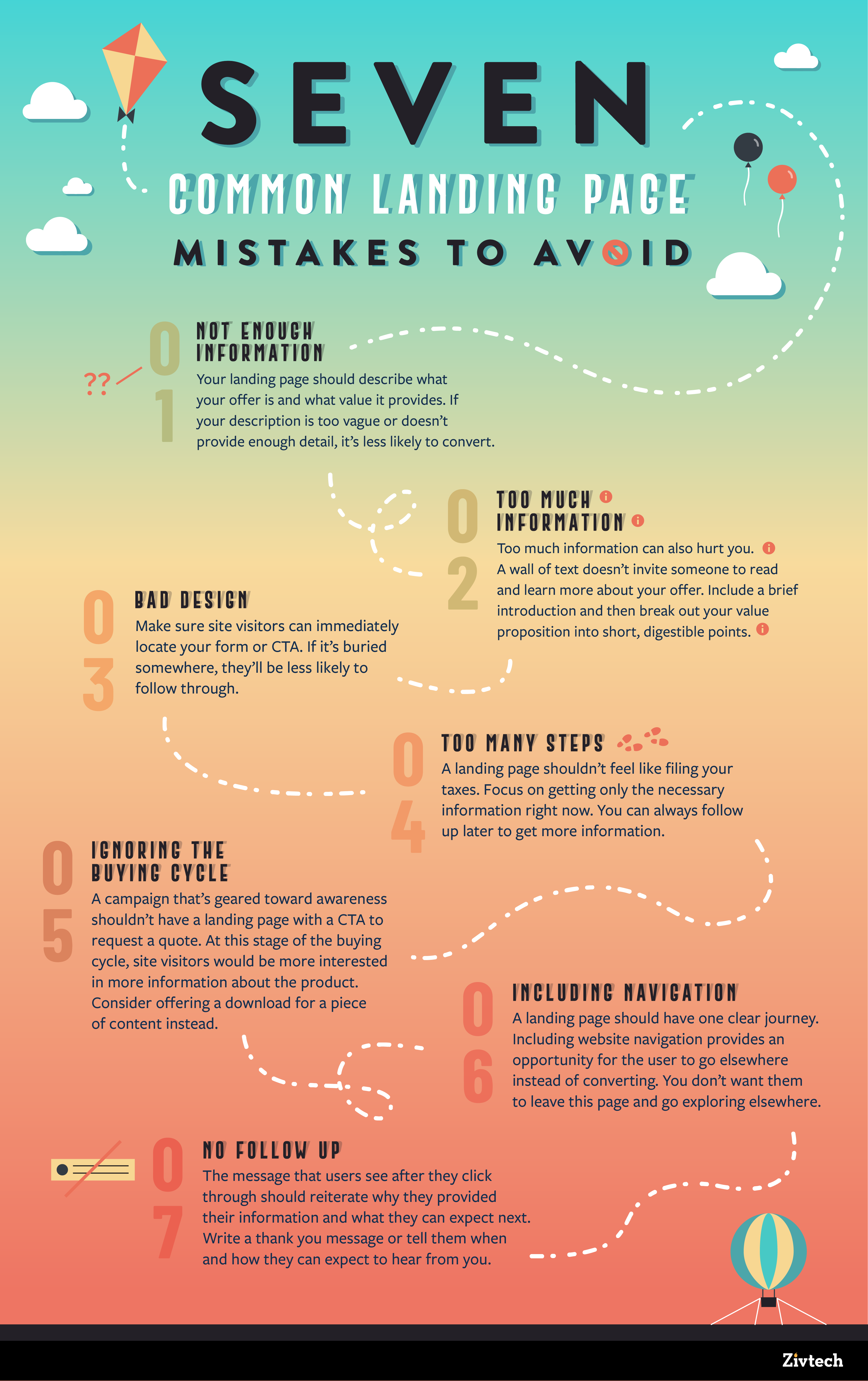
Not Enough Information
Your landing page should describe what your offer is and what value it provides. Why should someone give you their information or money? If your description is too vague or doesn’t provide enough detail, it’s less likely to convert.
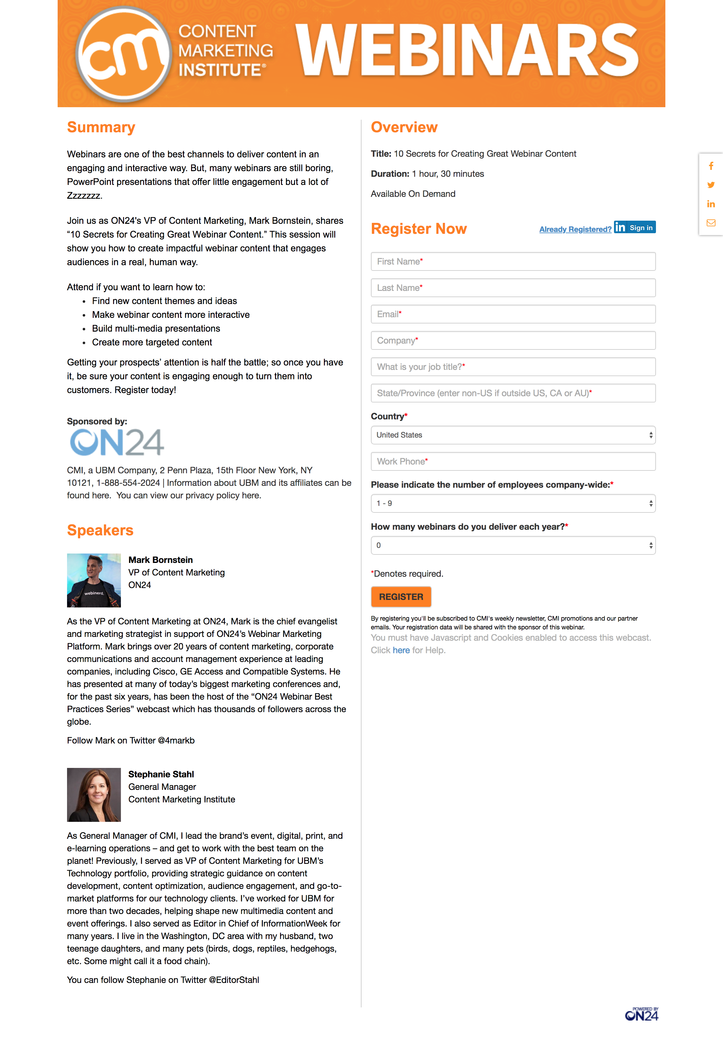
This example from Content Marketing Institute clearly articulates what topics will be addressed in this webinar, and what attendees can expect to get out of it. They also provide background information on the speakers, which builds credibility.
Have an unbiased third party review your landing page to make sure it’s clear and provides enough information about your offer.
Too Much Information
Too much information can also hurt you. A wall of text doesn’t invite someone to read and learn more about your offer.
Bullet points are a great way to highlight key points without overwhelming the reader. Include a brief introduction and then break out your value proposition into short, digestible points.
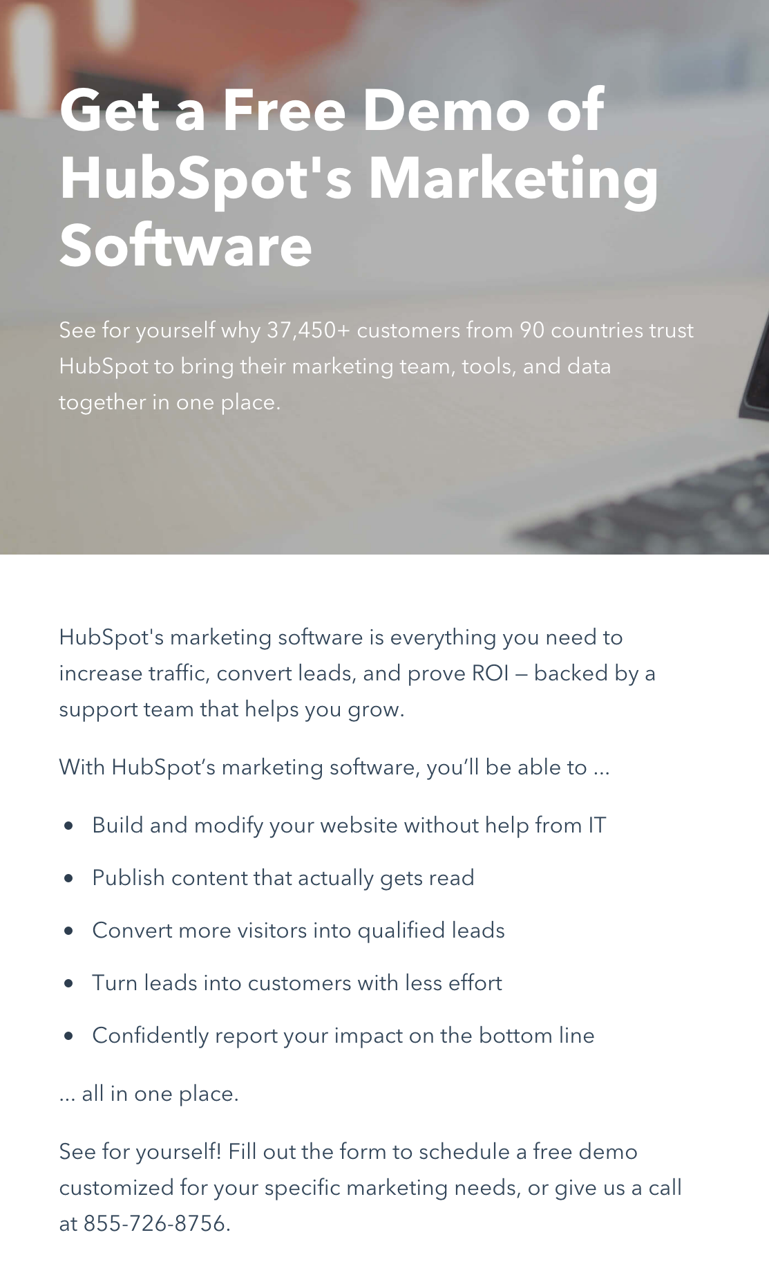
This Hubspot landing page effectively communicates the value of their marketing software in just a few clear bullet points.
Bad Design
Make sure site visitors can immediately locate your form or CTA. If it’s buried somewhere, they’ll be less likely to follow through. Forms are typically placed on the right-hand side with a description and key value points on the left. CTA buttons can often be found closer to the top of the page.
Too Many Steps
A landing page shouldn’t feel like filing your taxes. Focus on getting only the necessary information right now. You can always follow up later to get more information. This example from Shopify only prompts users to enter their email to get started.

Ignoring the Buying Cycle
If you’re running an ad campaign that’s geared toward awareness and education, it’s probably not a great idea to create a landing page with a CTA to request a quote. At this stage of the buying cycle, site visitors would be more interested in getting more information about the product, not necessarily receiving a quote. Consider offering a download for a piece of content instead.
Including Navigation
A landing page should have one clear journey that you want site visitors to take. Including website navigation provides an opportunity for the user to go elsewhere instead of converting. You don’t want them to leave this page and go exploring elsewhere.
No Follow Up
The message that users see after submitting information or making a purchase should reiterate why they just provided their information, and what they can expect next. If they downloaded a piece of content, write a thank you message that includes a link to the content or where they can access it. If they requested more information about a product or service, tell them when and how they can expect to hear from you.
Focus on the Goal
A bad landing page can cost you a significant number of conversions. Avoid these common mistakes to improve your conversion rates and turn site visitors into happy customers.