As of Drupal 8.7, the Media and Media Library modules can be enabled and used out-of-box. Below, you'll find a quick tutorial on enabling and using these features.
out-of-box before media and media library
In the past there were two different ways to add an image to a page.
-
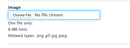
An image could be added via a field, with the developer given control over its size and placement:
-
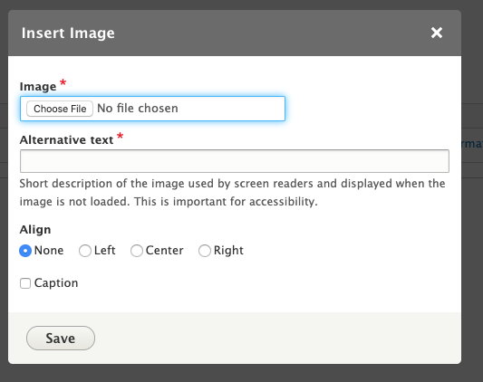
An image could be added via the WYSIWYG editor, with the editor given some control over its size and placement:
A very straightforward process, but these images could not be reused, as they were not part of a reusable media library.
reusing uploaded media Before Drupal 8.7
Overcoming image placement limitations in prior versions of Drupal required the use of several modules, a lot of configuration, and time. Sites could be set up to reference a media library that allowed editors to select and reuse images that had previously been uploaded, which we explained here.
This was a great time to be alive.
What is available with Media Library
Enabling the Media and Media Library modules extends a site's image functionality. First, ensure that the Media and Media Library core modules are enabled.

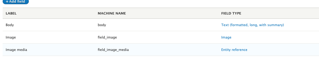
A media entity reference field must be used with the Media Library. It will not work with a regular image field out-of-box.
On the Manage form display page, select "Media library" widget.

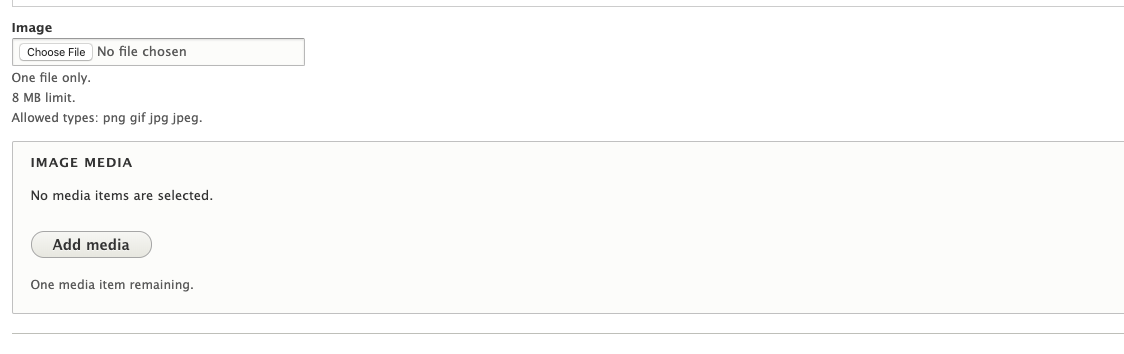
On the "Node Add" and "Node Edit" forms, you’ll see the below difference between a regular image field and a field connected to the media library.
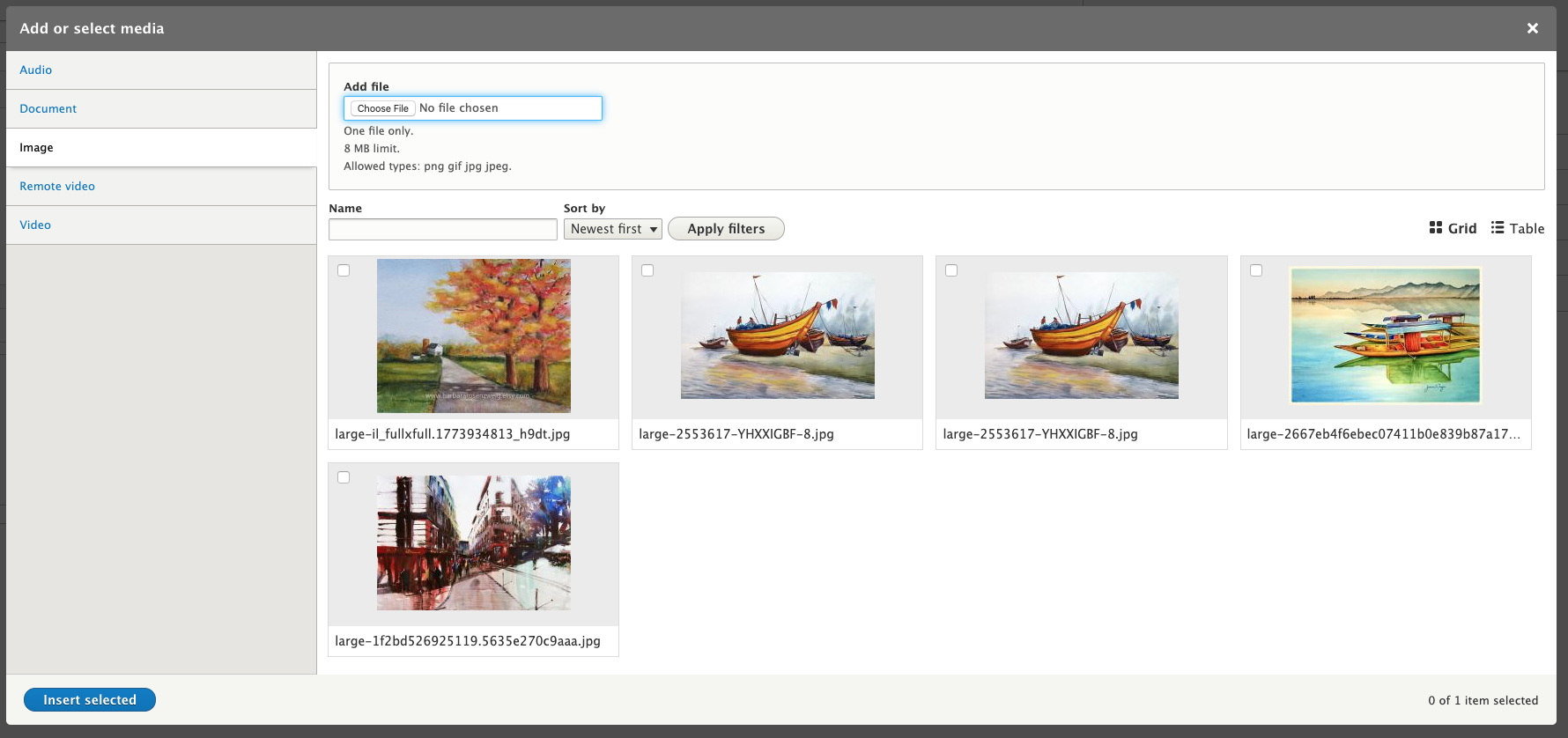
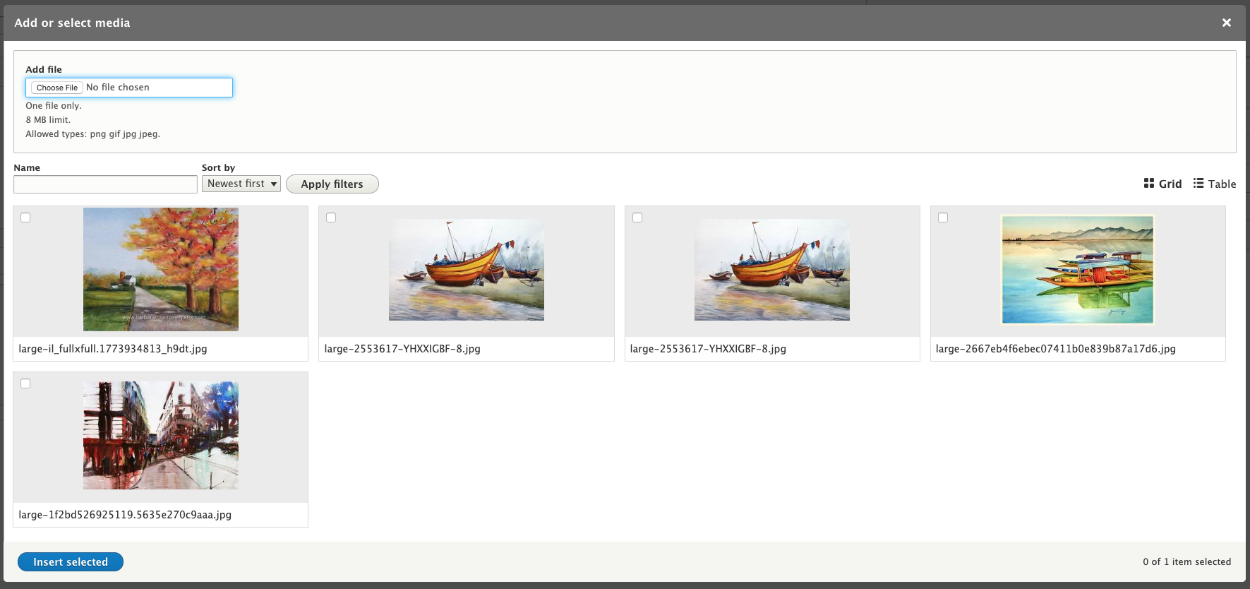
Click on “Add media” and you’ll see a popup with the ability to add a new image to the library or to select an image that is already in the library.

With a simple configuration of the field, if multiple media types are allowed in the field, you’ll see vertical tabs for each media type.
WYSIWYG configuration
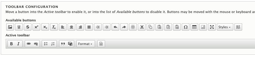
The WYSIWYG editor requires a few steps when configuring the media library for a specific text format. First, a new icon will appear with a musical note overlapping the image icon. This should be added to the active toolbar and the regular image icon should be moved to the available buttons.
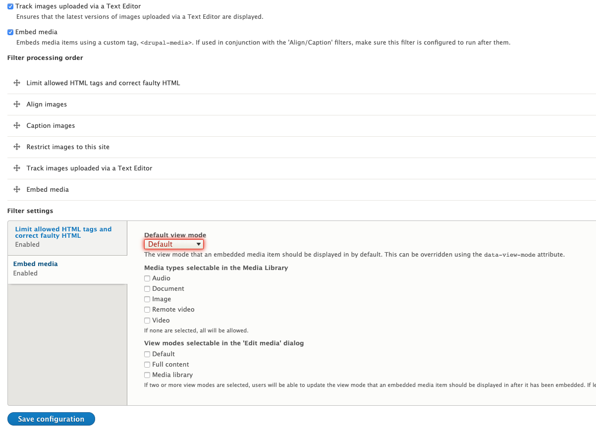
Under “Enabled filters,” enable “Embed media." Under the filter settings, vertical tab settings can be chosen for media types and view modes. Once that configuration is saved, you’ll see on a WYSIWYG editor that you have the same popup dialog for adding a new image to the media library, or selecting an already-uploaded image.
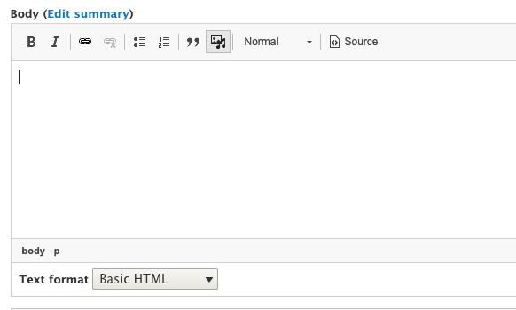
Once you are on a "Node Add or "Node Edit" page with a WYSIWYG element, you’ll see the media button (image icon plus musical note).
Clicking on the media button brings up the same, familiar popup that we saw earlier from the image field:
This article is an update to a previous explainer from last year.