With phone in hand, laptop in bag and earbuds in place, the typical user quickly scans multiple sites. If your site takes too long to load, your visitor is gone. If your site isn’t mobile friendly, you’ve lost precious traffic. That’s why it’s essential to build well organized, mobile ready sites.
But how do you get good results?
- Understand whom you’re building for
- Employ the right frameworks
- Organize your codebase
- Make your life a lot easier with a CSS preprocessor
Let’s look at each of these points.
Design For Mobile
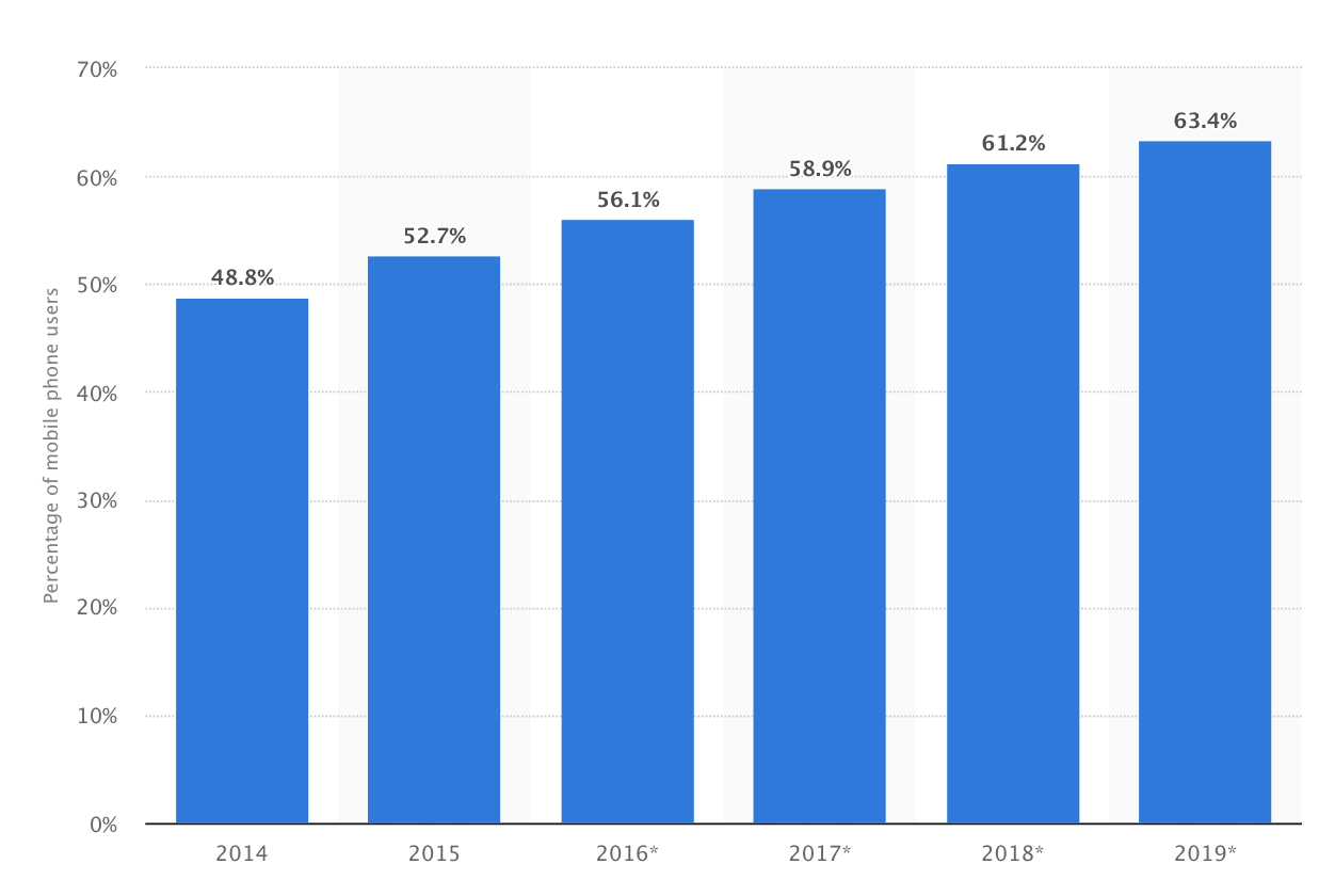
When you look at usage statistics, the trend is clear. This chart shows how mobile device usage has increased each year.
A vast array of mobile devices accomplish a variety of tasks while running tons of applications. This plethora of device options means that you need to account for a wide assortment of display sizes in the design process.
As a front end developer, it’s vital to consider all possible end users when creating a web experience. Keeping so many display sizes in mind can be a challenge, and responsive design methodologies are useful to tackle that problem.
Frameworks that Work
Bootstrap, Zurb, and Jeet are among the frameworks that developers use to give websites a responsive layout. The concept of responsive web design provides for optimal viewing and interaction across many devices. Media queries are rules that developers write to adapt designs to specific screen widths or height.
Writing these from scratch can be time consuming and repetitive, so frameworks prepackage media queries using common screen size rules. They are worth a try even just as a starting point in a project.
Organizing A Large Code Base
Depending on the size of a web project, just the front end code can be difficult to organize. Creating an organizational standard that all developers on a team should follow can be a challenge. Here at Zivtech, we are moving toward the atomic design methodology pioneered by Brad Frost. Taking cues from chemistry, this design paradigm suggests that developers organize code into 5 categories:
- Atoms
- Molecules
- Organisms
- Templates
- Pages
Basic HTML tags like inputs, labels, and buttons would be considered atoms. Styling atoms can be done in one or more appropriate files. A search form, for example, is considered a molecule composed of a label atom, input atom, and button atom. The search form is styled around its atomic components, which can be tied in as partials or includes. The search form molecule is placed in the context of the header organism, which also contains the logo atom and the primary navigation molecule.
Now Add CSS Preprocessors
Although atomic design structure is a great start to organizing code, CSS preprocessors such as Sass are useful tools to streamline the development process. One cool feature of Sass is that it allows developers to define variables so that repetitive code can be defined once and reused throughout.
Here’s an example. If a project uses a specific shade of mint blue (#37FDFC), it can be defined in a Sass file as $mint-blue = #37FDFC. When styling, instead of typing the hex code every time, you can simply use $mint-blue. It makes the code easier to read and understand for the team.

Let’s say the client rebrands and wants that blue changed to a slightly lighter shade (#97FFFF). Instead of manually finding all the areas where $mint-blue is referenced on multiples pages of code, a developer can easily revise the variable to equal the new shade ($mint-blue = #97FFFF; ). This change now automatically reflects everywhere $mint-blue was used.

Another useful feature of Sass is the ability to nest style rules. Traditionally, with plain CSS, a developer would have to repetitively type the parent selector multiple times to target each child component. With Sass, you can confidently nest styles within a parent tag, as shown below. The two examples here are equivalent, but when you use Sass, it’s a kind of shorthand that automates the process.
Traditional CSS

Sass

Although there are a lot of challenges organizing code and designing for a wide variety of screen sizes, keep in mind that there are excellent tools available to automate the development process, gracefully solve all your front end problems and keep your site traffic healthy.
This post was originally published on July 1, 2016 and has been updated for accuracy.