A Nonprofit Focused on Financial Literacy
Clarifi is a nonprofit organization on a mission to make financial literacy more accessible to individuals in New Jersey, Delaware, and Pennsylvania. For fifty years, they’ve helped people with financial issues like debt, household budgets, and foreclosure. Clarifi also strives to protect consumers from scams, predatory lenders, and other exploitative tactics that seek to hurt the average person.
Addressing User Concerns
As an organization, Clarifi wants to present itself as empathetic and helpful, and as a resource that consumers can always turn to when they experience financial trouble. Their website needs to serve as a catalyst for this relationship.
Clarifi’s old Drupal 6 website was difficult for visitors to navigate; users were unable to easily locate the information they needed to address their financial concerns and request help. As a result, users weren’t scheduling consultation meetings through the site and frequently called the office to ask questions that should have easily been answered through the website. The organization’s staff was doubling efforts and spending time that otherwise could have been spent furthering their mission.
The marketing team also spent significant amounts of time generating content to help and inform their audience, but they weren’t able to capitalize on these efforts due to the website’s suboptimal information architecture. Relevant resources didn’t receive proper visibility and weren’t as effective at encouraging conversions.
In addition to changes to the information architecture, Clarifi wanted to improve site metrics such as bounce rate, conversions, and session duration. They also wanted an updated design that would better position the organization as modern, knowledgeable, and trustworthy.
Clarifi sought a digital agency with extensive experience in Drupal upgrades, user experience design, and detailed architecture planning to optimize and modernize their website.
Our team recommended a one month discovery phase with Clarifi’s C-suite, marketing team, and representatives from major departments in order to define project goals and priorities. We suggested a revised information architecture plan, a content audit, an in-depth user experience audit and design process, user testing, and high-fidelity mockups.
Mapping Success Through User Testing
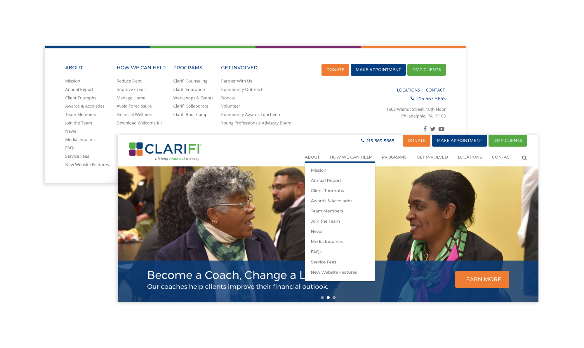
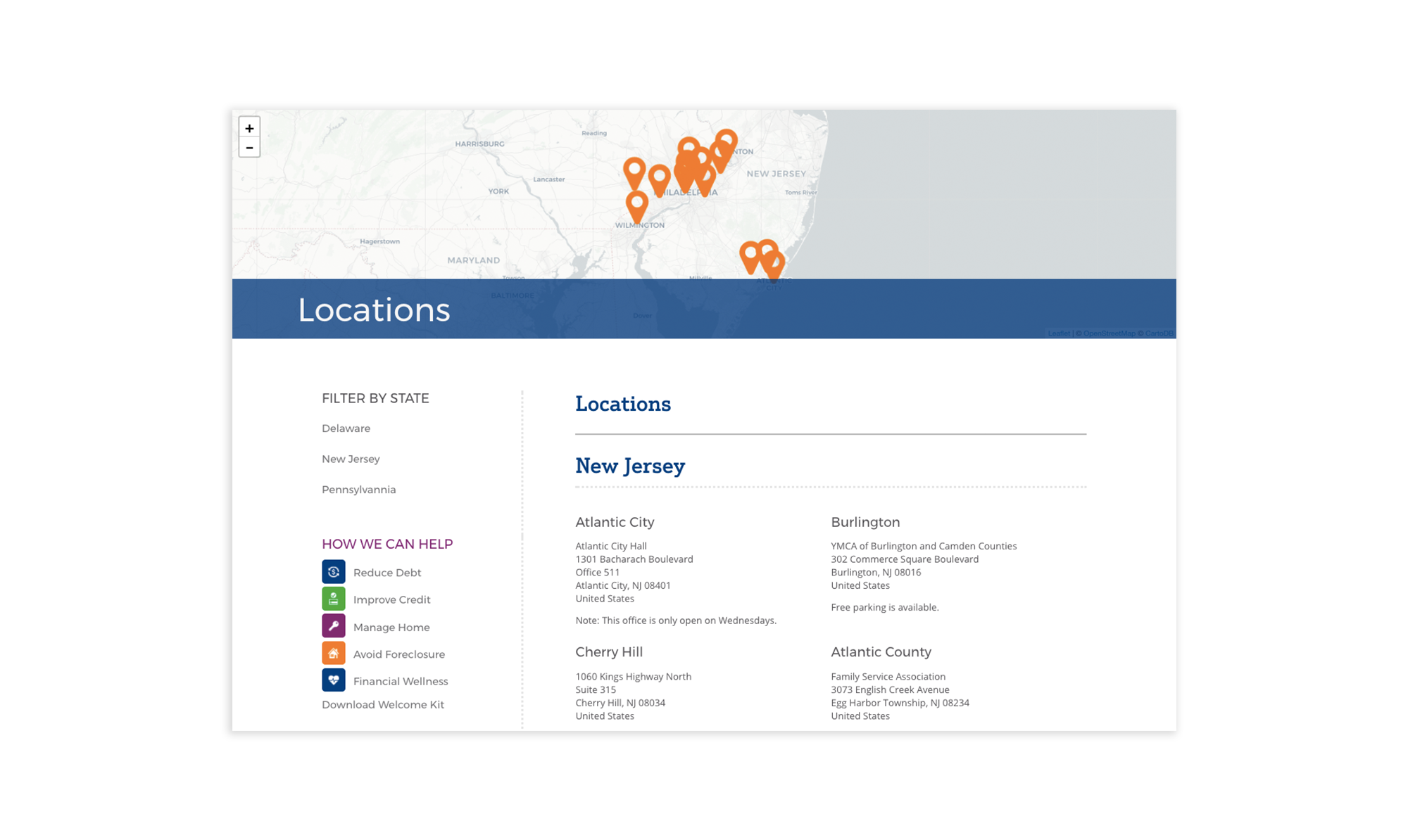
We kicked this engagement off with a thorough discovery with representatives from every major department. We identified their priorities as well as their perspectives on the site’s shortcomings. This helped us re-think the main navigation and architecture, devising a totally new sitemap and information architecture plan that better tied critical pieces of the site together.
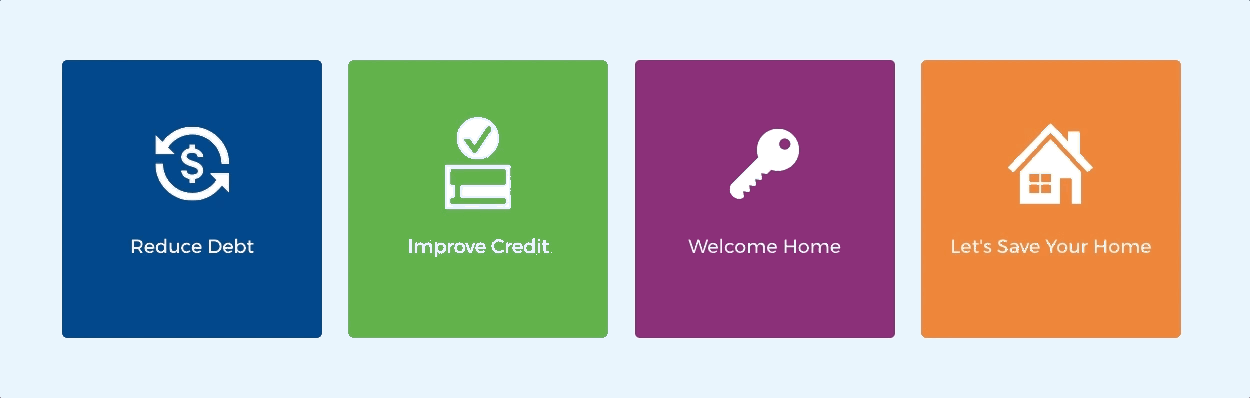
Once we came to an agreement on the flow of the site, we began wireframing the main pages, including an interactive tool that users could use to drill down to the service that best fit their needs quickly.
To validate our design and navigation decisions, we coordinated user testing sessions with Clarifi and their existing clients where we facilitated in-person user interviews with our wireframes. This helped us identify potential pain points and key user insights, generate new ideas, and validate successes.
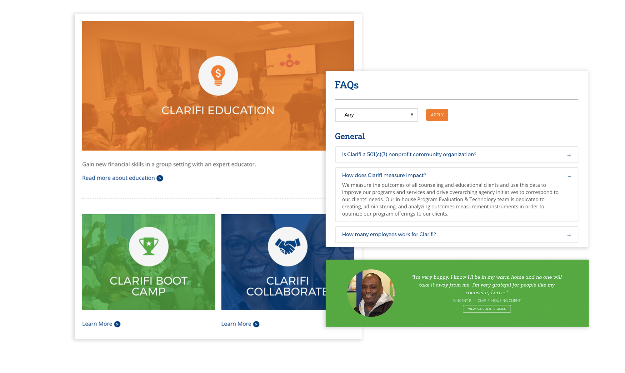
We used these insights to then build off our wireframes and move onto visual styling and mockups, including mobile versions, to conceptualize a fully-fleshed out application. We also created a style guide to ensure that future features, pages, and content are all streamlined and consistent with one another.
A User-Centric Experience
After the launch of the new site, Clarifi experienced a decrease in the number of confused members who called the office asking for help because they couldn’t locate information on the website. The number of appointments scheduled through the website increased significantly with a new average of 150 appointments per month, resulting in more success stories and satisfied clients.
The website also saw improved analytics with a lower bounce rate, higher average time on the site, and an increase in conversions.
Optimizing the information architecture allowed the marketing team to develop a more focused roadmap and strategy, which prompted the team to grow for the first time in more than five years.
Clarifi’s team was thrilled with the outcome of the project. Board member Peter B. stated, “This is first class. Maybe one of the best sites I have seen. Well thought out and well presented.”