Take a look at any website or app, and more often than not, you’ll find “flat” elements. Trending recently, these flat elements take a minimalist approach and strip away any styles that would give three dimensional illusions (I’m looking at you, drop shadow). By doing this, the viewer is presented with a clean, simple interface that is aesthetically pleasing to the eye.
But it’s not so simple.
The Downsides of Flat Design
While these may look great, they have their pitfalls. More often than not, they use weak signifiers, or perceptible cues that users rely on to understand what is clickable. Because everything was flattened, users are unsure if they’re clicking on a button or just plain copy text with a rectangle behind it.
Professor Jürg Nänni, author of Visual Perception said:
“A rectangle with sharp edges takes indeed a little bit more cognitive visible effort than for example an ellipse of the same size. Our ‘fovea-eye’ is even faster in recording a circle. Edges involve additional neuronal image tools. The process is therefore slowed down.”

Confirming Nänni’s statement, a study showed that when presented with two variations of the same web page, users spent more time on the page with flat designs as compared to the page with obvious cues.
The findings suggest that users struggled to locate the element they wanted, or weren’t confident when they first saw it. This is a problem for user experience. A three-second struggle could determine whether or not the user wants to continue on the web page, or just give up with the company altogether.
So what is the compromise? Design or functionality? These two sides of the coin are often debated in user experience design.
Users Adapt to New Design Concepts
As time goes on, it’s possible that more users will adapt to flat design and come to recognize where and what to click on the page.
“The secret to a flat interface is in its simplicity hidden behind simple shapes and colors of elements (roughly speaking – red for remove, green for download). Users have learned to distinguish between buttons and input elements; they do not need to add glare or artificial volume.”
Sergey Shmidt, Designer at Designmodo (web design blog and WordPress themes store)
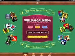
Consider the evolution of the Apple native app icons circa 2007. They are noted for their skeuomorphism, a concept where designed items are represented to resemble their real-world counterparts (think of the Game Center app that was styled to look like a billiards table, or the iBooks app that was styled to look like a wooden bookstand).
To help people understand how to use the interface, they made all of the elements look as realistic as possible. Using principles still used today, they made buttons look like physical buttons. The familiar shapes and associations help users find a function that’s similar to that of the traditional counterparts. Thanks to technology, we no longer have to resort to skeuomorphism to convey a message.
“Flat design isn’t a trend – it’s the norm. As web designers, we rely on technology to bring our ideas to life – constraints in tech may have been what pushed us toward skeuomorphism in the days of Web 1.0 and 2.0. Now that CSS and JavaScript are letting us use design in more interactive ways we don’t need to emulate a 3D world, instead we can rely on things like Z-Axis animations to bring depth to our digital designs.”
Cody Iddings, Sr UX Designer at Digital Telepathy
The Future of Flat Design
As time goes on, we will no longer need significant depth and dimension to distinguish what a button is; the association will be strengthened every day as we continue to use our devices. There may be some confusion, especially for people not accustomed to using the web, but there are ways to ease people into this transition by making the button signifiers as clear as possible. By being consistent with shape and placement, it will become a lot easier to discern what is and is not a button.
Here’s a list of helpful tips to ease users into flat button design.
When using flat buttons:
- Don’t extend buttons to the edges of pages so that they look like sections
- Use a standard button shape (rectangle, oval, circle - whatever aligns with your brand)
- Make sure they have enough contrast or are colored to stand out (including the text!)
- Make the primary action a brighter color than the secondary (DELETE vs. CANCEL)
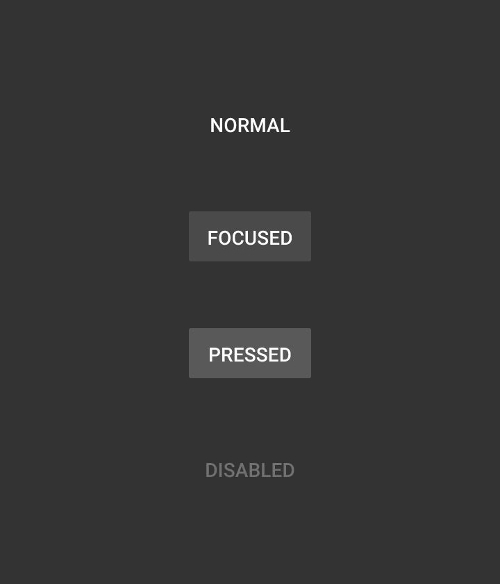
- Always make feedback states (hover, selected, disabled)
- Place them where users can easily see or find them
- Don’t have competing elements (a green section on the same page as a green button)
- Always include labels on the buttons so users easily can tell what they’re clicking on (make sure the wording is concise and not ambiguous)
“I believe flat design is not just a trend; but part of the evolution of content delivery in its simplest form, which in turn enhances the ability for us to more easily absorb the information. And for this reason, unless a new trend gives way to further improving this perception, I believe flat design (and in a larger spectrum minimalism) will be around for some time.”
Payman Taei, Founder of Visme (DIY presentation and infographic online tool)