According to a study conducted by Kissmetrics, product assessment only takes ninety seconds, and up to ninety percent of that assessment is based solely off of color.
Whoa.
As any skilled web designer understands, color plays an important role in the user experience.
User experience (UX) considers all of a user’s possible interactions with a product. These interactions affect the emotions and attitudes a user has about a particular brand, and can determine if certain products or services provide the user with valuable meaning.
When designed well, a website’s color scheme should effectively deliver a message to your user about your brand, product, and services. Certain colors convey different messages. When received by a user, these messages can influence how he or she evaluates your brand, as well as how they interact with the site.
Here are a few ways color can affect UX.
Brand recognition
Quick! What color is Twitter? How about Facebook? Vimeo?

Notice anything?
Consumers associate color with specific emotions and industries, so picking a color to represent your brand should be a calculated decision.
The color blue is closely associated with the tech industry, and according to the guide below, it promotes feelings of trust, dependability, and strength.
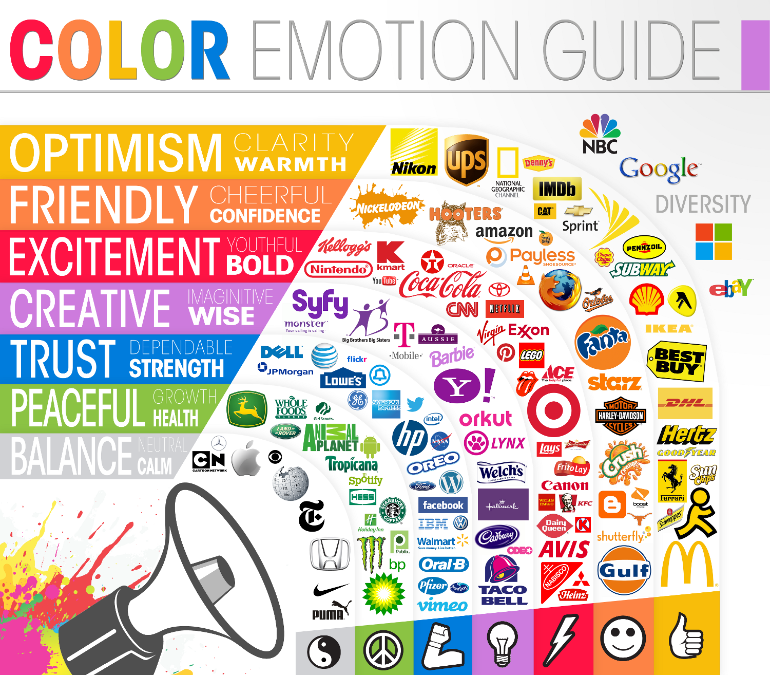
The feelings that the color blue evokes in a user are especially important for brands like Twitter, Facebook, and Vimeo because these platforms all collect large amounts of user data and personal information.
In order for a user to enjoy the time they spend on these sites, they need to feel like their personal information and data are secure.
For these brands, predominately featuring the color blue throughout their respective logos and websites fosters a positive user experience.
Accessibility
Color not only affects the way a user feels about your brand, it also affects how he or she interacts with the content on your site.
You could produce brilliant content, but nobody will know if they can’t read it. When choosing a color for your website’s text, there are a few factors to take into consideration.
First, ask yourself if your site is accessible to those with visual impairments. According to Prevent Blindness America, color blindness affects roughly eight percent of males and one percent of females.
While it is impossible to design for each individual case of colorblindness, a general rule is to avoid color combinations like green/red, green/brown, and green/grey, as these combinations are difficult to differentiate for those who are color blind.
Next, using high contrasting colors is a good idea, but it is important to know when to use dark text over light backgrounds and light text over dark backgrounds. For example, white paragraph text over a black background is high in contrast but strains the eyes.
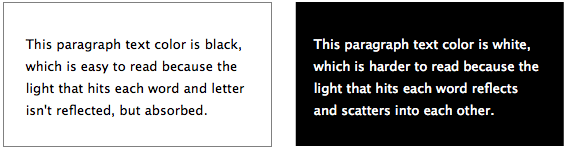
This type of text would be better suited for headings and titles rather than long-form text.
It’s also important to be aware of where your users will be accessing your site. For example, Twitter has a night mode option available for both mobile and desktop users.

Night mode inverts the hues of the site to make it easier to view in environments with less light, which allows users to scroll through their feed longer without straining their eyes.
Clickability
It might be obvious, but if you want your user’s attention to focus on a particular feature, it has to stand out.
Will your users be inclined to click on a red “read more” button on a red background? Probably not.
The clickability of your site’s features greatly affects the way your users interact with your content. If a user comes to your site to find information but is impeded by poor color choices and design, they’re likely going to bounce.
A high bounce rate isn’t good for business or conversions, and it probably means that your users aren’t finding the information they need and are leaving your site frustrated.

In the example above, the Dropbox homepage features a dark blue button against a light blue background. The button stands out and immediately invites users to try their service for free for thirty days.
If the button was lighter blue, or if the text overlaying the button was a darker blue, it might not be so obvious to the user to click it. At the same time, if the button was orange it might invite even more users to click. But this is where the business needs to A/B test to determine the value of a chosen color.
Both dark blue and orange are contrasting colors against the light blue background, but if the dark blue button converts more than the orange during A/B testing, it is a more valuable color.
Dropbox has also chosen blue as their color scheme for both the company’s logo and website which is in line with the examples provided above. Similar to the way Twitter, Facebook, and Vimeo secure user information, Dropbox brands itself as a “secure file sharing and storage solution” and the color blue reinforces the feelings of security and dependability.
Color affects user experience both practically and psychologically. Choosing a color scheme for your business and site should be discussed and tested to decide which colors will result in the best outcome for your brand, your audience, and your message.