Let’s say you (like anyone else with a website) want to increase traffic. Or you want to retain current users by enhancing the features they use. Or maybe you want to minimize support calls. No matter what your goal is, I have a one-word solution that I swear by: engagement.
Whether the goal is to bring new users to your site, keep their attention, or help them successfully complete tasks, engagement is the glue behind successful interactions. When users are engaged with the content you’ve presented, they’re going through a seamless, enjoyable process that accomplishes what they came to do...and then some.
We know that not all sites can be enjoyable to use. If you’re paying a parking violation ticket, are you going to leave that “Thank you for your payment” page smiling? Chances are, you aren’t thinking about your generous contribution to the city.
Your enjoyment level will never be high here, but what if making that payment felt easy? Instead of a dense form with 17 required fields and the theme of “I haven’t been altered in 15 years,” what if it was presented as a quick and easy 3-step process? The first thing I credit for an experience improvement like this is game design.
Games can be an inspiration to the most maddening site processes
There are many reasons games have such a positive and addicting effect on people. Since games are interactive experiences that people choose to do in their free time, it’s helpful to look at the reasons why people enjoy playing them so much. Games are simply another type of experience, so why wouldn’t the same principles of enjoyment translate to how someone uses a website?
When I want to apply game design tactics to websites I’m working on, the goal isn’t to replicate LinkedIn’s method, which presents a “Keep it up! You’re doing great!” message with progress bars and all-star profiles. While this strategy is a great adaptation, it isn’t practical to the majority of websites we work with. If the subject matter is infuriating or glum by nature, those methods will feel like mockery.
To successfully gamify each website that comes our way, we benefit more by looking at the details of games in both the interface and the psychology.
What are some things video games provide to hold a player’s attention?
- Milestones to complete (and rewards for reaching them)
- Easy access to a toolbox of resources
- Small tasks within larger objectives and frequent senses of completion
- Low risk, constant decision making
- Tutorials that give assurance upfront
- Gradual increase in difficulty
- Limited resources (giving your player FOMO)
- Personalization based on player’s actions
- Helpful quick glance information and tools around the edges of the screen
- Setting a tone before entering a new level or environment
- A sense of community and social status
This list immediately makes you think of some ways your website can benefit from game fundamentals, doesn’t it? Let’s look at some examples of how these can be repurposed (without adding completion badges).
Milestones to complete (and rewards for reaching them)
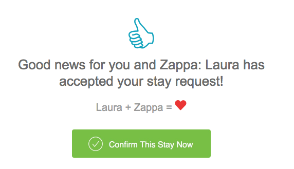
The image above is what I see after I go through the process of booking a dog sitter. After completing the steps of selecting a sitter, choosing the dates I need, and typing in payment information and care instructions, I have reached a pretty sizeable milestone.
How much satisfaction would you have after all that work if the submission just returned the word “Submitted?” It wouldn’t be nearly as conversational and friendly. While the heart may be teetering on the edge of mockery, the approach is spot on for the brand and audience.
Easy access to a toolbox of resources
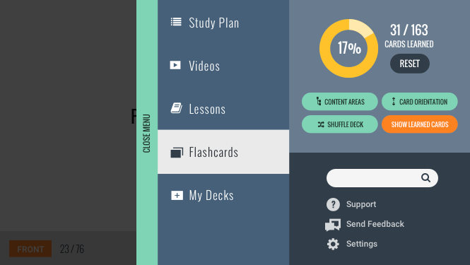
In many video games, you rely on a set of resources to strategically select as you go along. If you think about all the helpers you have on screen at once, you can start to see site components, like your main navigation, as a toolbox.
The example above is a pullout menu drawer for a flashcard app we designed. Users can focus on the card content area but always know where the rest of their resources can be found without the design being intrusive.
Areas of your website, such as support buttons or sidebars, can be considered a toolbox for your users. To determine what resources to include, read through your main content in the perspective of each of your user personas. Ask yourself: What do I need as I get further and further into the content? Outline what questions might be asked, and what tasks may need to be performed. What can you include that answers those calls?
Small tasks within larger objectives and frequent senses of completion
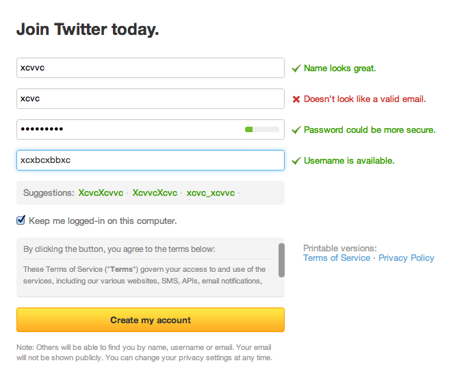
Real-time form validation keeps your users engaged in a multitude of ways. They’re reassured they’ve done something right the second they complete it. There are constant visual and textual interactions to keep the page from feeling stale. There are direct instructions if a task needs to be redone without requiring the extra step of hitting “back” from an error page (or even worse, the page refreshing with sad, empty fields).
Low risk, constant decision making
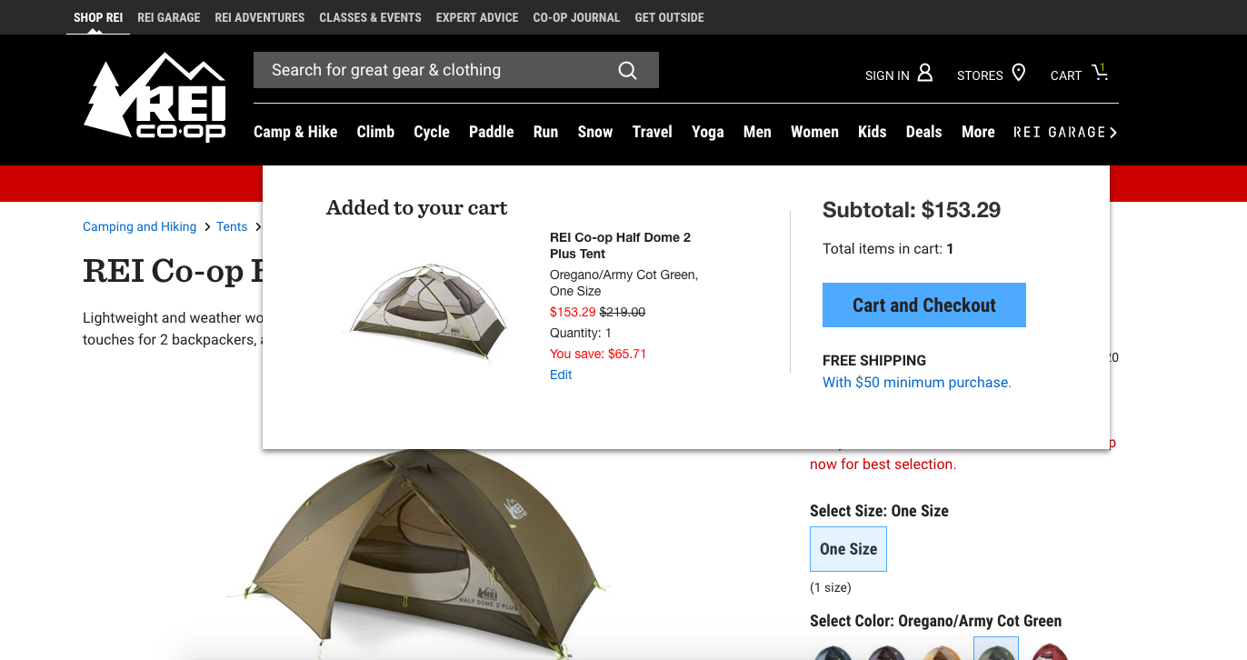
Gamers love clicking around on different things to reach results because the risk is relatively minimal. In games, users work more on impulse than they would on an ecommerce site, for example. They may not perform as well in the game by clicking on everything, but they aren’t accidentally making a big purchase.
To ease your shopping users’ minds, use noncommittal button language like “Add to cart” instead of “Buy now.” Providing a visual clue of what has been added to a shopping cart, like animating the item that’s added, also helps with quick, lower risk decision making. The clue provides trust and an omnipresent overview for the user to reference at any time.
Tutorials giving assurance upfront
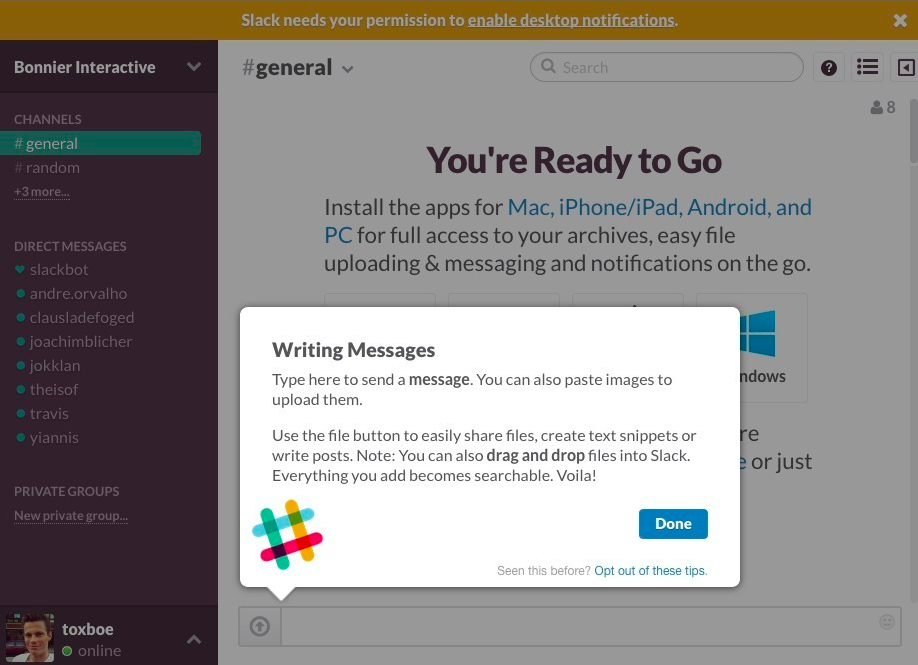
How often do you see a “Take a tour” button and wonder “who has time for that?” Go ahead and skip that tour because Slack found a simpler way to provide the tour. The helpful tooltips are presented in a way that gives the user control of the tour without realizing they’re even taking one.
Time and time again we hear “Design is best when you don’t notice it.” Asking users to take a tour is noticeable and ignored frequently, but if you can weave in tips as users need them, they will appreciate the slight hand-hold. Feel free to step away from the support line now.
Gradual increase in difficulty
While tasks performed on your site may not be difficult, the drop-off rate goes up if you throw too much at the user upfront. If you’ve already chunked out your multi-step process, do your user even more of a solid by saving the heftier screens for later.
If you provide five steps to complete a task, don’t make the first one a choice between ten options, pretending to read terms and conditions, and answering further questions with input fields. This scares people off. Your website isn’t a medical form, no matter how much information you need to gather. Make the first screen as few lines as possible, and keep it more conversational. Save the bigger asks for later, after you’ve gained their engagement. Users won’t back out of step four as easily as they will step one.
What really gets them to the “thank you” page
When you think about what your users want, more often than not the answer is to perform a task. Their journey has a start and a finish line, just like a game. The reason why games keep us more engaged than the majority of websites isn’t an enigma.
If you outline your main finish lines, you can work backwards and define what users may need to get there. The interface and psychological principles of game design can be used as a toolbox for improving any of these journeys. Each method you work in will be a step towards more engagement.