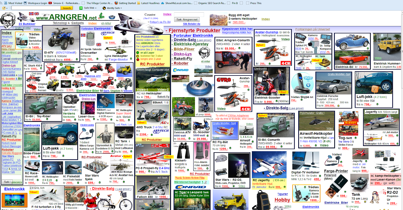
White space is pretty important in design. In an age where there is an abundance of information, sometimes we just want to cram everything onto a website or poster. Exhibit A below.
But this is not the answer. White space is the answer.
But what exactly is it, you ask?
White space is the negative space left in a composition. It has no text or images and it doesn’t have to be white - it can be any color. When utilized correctly, it can make the design stronger and look more professional.
Think of white space like this: Times Square is your design. It is also the example above. It’s loud, it’s overwhelming, and your eye doesn’t know what to look at first, or what to look at next. It feels claustrophobic and crowded. It’s an assault of information. White space in design is walking into the Apple store nearby. Calm, clean, and your eye knows to go to the shiny new iPhones, plus there’s lots of space around you. Much more relaxing and ideal; you feel like you can breathe and it’s easy to figure out where in the store you need to go to see products, ask for help, or check out.
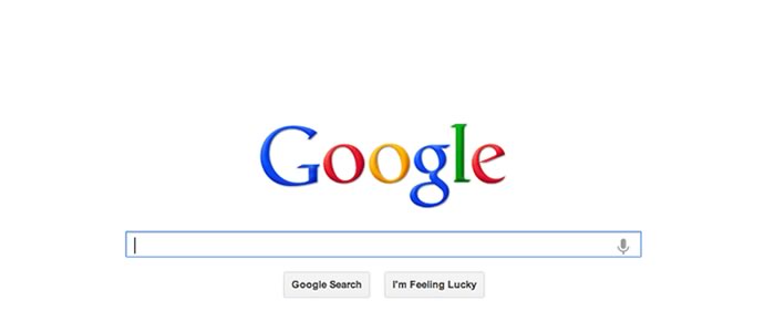
This is a more extreme example, but look at the Google page. Abundant white space, so you can focus solely on the task at hand, which is searching for something. Your eye knows where to immediately go. No excess fluff; there’s just the input bar and two buttons (with appropriate padding). A good thing to note with white space is that, generally, less is more.
Improve Legibility & Comprehension
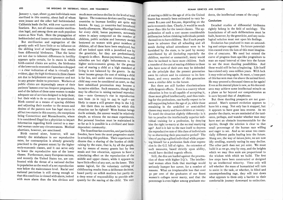
When you give design elements room around them to breathe (through increased padding in the layout and around paragraphs) it makes the design cleaner and easier for the user to comprehend. No one wants to read that solid block of text found in your textbook about the history of eugenics in twentieth century college biology. But if the paragraphs are broken up and given space between the lines, it’s a lot more enticing to look at, and it’s easier to understand.
“But all that empty space could be used for showing off my product/business/goods/services!” you might say.
That isn’t always the best way to present your brand, whether that be on a website or on a flyer.
More Focus & Attention
The more white space there is, the easier it is to distinguish the most important information. When looking at a lot of information on a page, the viewer can get overwhelmed. When there is a lack of clutter, the white space directs the eye to the subject of the page. This way, it’s easier to digest.
Branding Tone
White space can also help make your brand more easily identifiable. The amount of white space you have can give off different vibes, much like how your brand’s colors, typography, and image treatment can all affect the viewer’s perception of the company. Generally, the more white space your site has, the more professional and high-end it looks (i.e. Apple).

All in all, it’s important to know how to use white space to improve your design. In an age of too much information, it can offer a nice reprieve amidst it all with benefits like increased comprehension and readability. On top of that, it’s just more aesthetically pleasing. Simplicity is key!