In message delivery, you always have to consider what state of mind your audience will be in when they receive your message. Every bit of art direction (be it a marketing brochure or interactive exhibit) aims to get a point across, and considers mood to do so. It’s why we pick certain colors, imagery, and hierarchy of information. Not only do we want to represent the mood of a brand, we also want to speak to the audience’s current state of mind.
Provide reassurance through content
There’s a delicate balance between identifying with a user’s current state while also successfully altering (or maintaining) it.
Let’s consider an example. We recently designed and developed a website for a law firm. Their clients are dealing with frustrating situations and are coming to the site discouraged and looking for help. We had to find the right balance of showing that the law firm understands what they’re dealing with, while also portraying hope.
Car repossession is one of their topic areas. If this had just happened to you, would you want to be reminded with images of cars being towed? Or would you prefer to imagine yourself out of that situation with your car back?
We suggested imagery of someone unlocking a car door along with content that focused on the steps taken to get their car back, rather than copy that speaks to their frantic state. An unhappy audience will want to see content that reassures that you can help.
The sum of an experience is made up of a series of smaller ones
Beyond identifying overall moods (like frustrated), we need to look at the individual factors that resulted in such a mood.
Your state of mind fluctuates with any new information received, whether it’s in a relatively unnoticeable way, or drastic. Think about all of the events that unfolded throughout your day that contributed to your conclusive mood by the end of it. When you sum up your day, was it not just a series of experiences that make up a greater one?
Apply this to the sum of your feeling about a website you use. This can be applied to the series of experiences like a checkout process, or even how you feel while reading a single paragraph.
Our ultimate goal is to leave users feeling like they had a great experience, so we need to ask ourselves how we make every component evoke more positive reactions than negative.
Making constant mood-driven decisions
Let’s go over that checkout process example. We start by identifying a user’s starting mood coming to your website (like we did for the law firm), and then look at the ebbs and flows as they go through a series of processes.
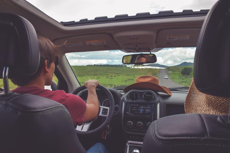
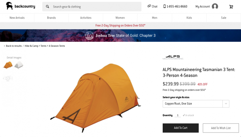
I was recently on an outdoor gear website trying to purchase a new tent for camping. Anything I would be buying on this website would be for a leisurely activity, so we can assume my mood was somewhere between neutral and positive, day-dreaming of an upcoming camping trip.
Aside from that overarching mood presumption, customers in this position may have a few other derivatives of content or happy. They have a sense of excitement, but there are a few user groups within that:
-
Seasoned campers who know what they’re looking for, and confidently select it.
-
Campers with moderate knowledge of what they need, but could use a little assistance and comparing.
-
New campers who have no idea where to begin, and are overwhelmed by the options.
There are endless starting mood complexes, but this covers the main user groups.
Establish personality-based goals
We should also make some predictions to mood based on the personalities of these user types. Understanding how a person of a more specific ecommerce site like this approaches a situation (like shopping), helps inform us of how to keep them engaged positively.
We can guess in this case that our users:
-
Are generally not in a rush
-
Are more on the calm side
-
Appreciate a serene type of aesthetic
-
Can handle a challenge
-
May potentially be on the less tech-savvy side.
These personality traits and user groups leave us with these personality-based goals to accomplish for an outdoor gear site:
-
Maintain calmness and excitement with white space and image-driven layouts. (Think about the environment in which they’ll use the product. There shouldn’t be over-stimulation.)
-
Provide an optional guide for purchasing to ease a potentially overwhelmed state.
-
Have clear outlines of the product details at each stage of the process for all user types. They’ll need reassurance that all their needs are covered.
-
Reflect the positive activity that they’re purchasing for through color, image selection, and overall tone.
-
Include bold, friendly messaging that can be slightly playful, yet concise.
Determine what actions shift moods
Keeping these points in mind will help deal with the mood fluctuations throughout the journey. How does your user feel when researching their product options? How does their mood change after adding an item to the cart, and then needing to enter card information? What shift happens in the mind when all fields are filled out, and all that’s left is reviewing your order to submit?
Pay attention to your inner monologue the next time you’re going through a multi-step process. Do you feel a sense of completion after hitting a “next” button? Do you groan when you have to select shipping information?
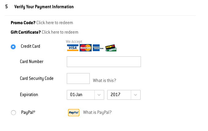
Personality aside, a lot of the positive points to touch on are based on statistics of people as a whole. We know people like minimal effort to get what they need, if it is not an engaging process like entering card information. We know people will be in a better mood on a confirmation screen.
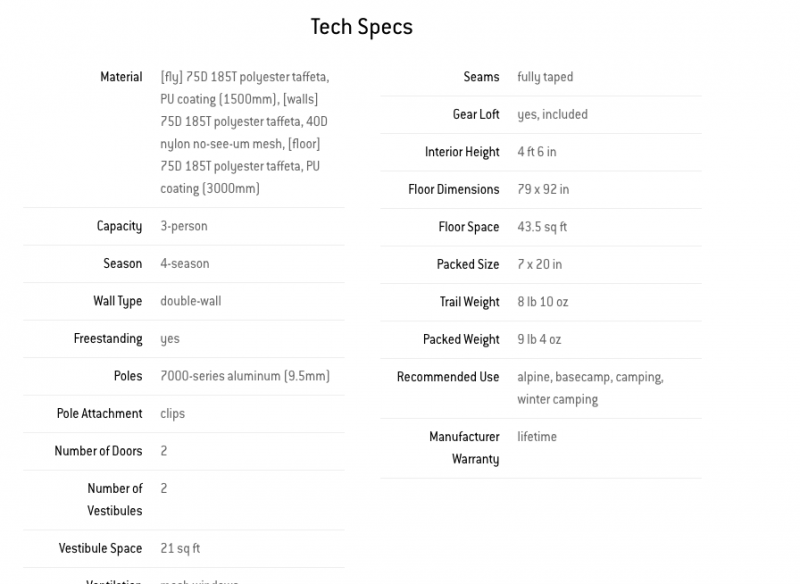
While we have some standard knowns, we can look for opportunities to add mood-based components on top of the standards. In our example, our goal was to always provide details, since a product like a tent has a lot of variables. Here, we can decide that even the preview of the product in a cart will display the helpful details such as: 2 person, all 4 seasons, lightweight for backpacking.
Another goal we defined is to keep layouts concise with ample white space. Maybe this leaves us with a decision to have those product details present, but a little smaller on the type hierarchy, so the previews still have balance.
It’s about balance (leaning more positive)
Not all parts of a process can be brought to a positive. Some steps are unavoidably negative (like that credit card form). What’s important is the reward for completing a task that leans negative, and the other high points of the process that cancel out this one. The balance to achieve is more positive points of the journey than negatives, and to end on a positive note.
We create to convey, engage, and delight. By not analyzing these mood-driven metrics of success, we would be ignoring the main ingredient of a good experience.
Considering a rework of your site or application's design? Let us know how we can help!