You may have seen the term heuristic evaluation pop up in discussions about user interface and experience design. It’s a method that’s used to check the user-friendliness of your product, be it software, a website, an app, or any other prototype.
In a heuristic evaluation, expert reviewers use your product and perform tasks that would be expected of any user. In doing so, they compare it against a set of qualitative guidelines that establish best practices for usability.
Because there are multiple and varied sets of principles, it’s important to employ the appropriate set of heuristics when proceeding with an evaluation. The most well known set is Jakob Nielsen and Rolf Molich’s 10 Usability Heuristics for User Interface Design, listed below.
Visibility of system status
The system should always keep users informed about what is going on, through appropriate feedback within reasonable time.Match between system and the real world
The system should speak the users' language, with words, phrases and concepts familiar to the user, rather than system-oriented terms. Follow real-world conventions, making information appear in a natural and logical order.User control and freedom
Users often choose system functions by mistake and will need a clearly marked "emergency exit" to leave the unwanted state without having to go through an extended dialogue. Support undo and redo.Consistency and standards
Users should not have to wonder whether different words, situations, or actions mean the same thing.Error prevention
Even better than good error messages is a careful design which prevents a problem from occurring in the first place. Either eliminate error-prone conditions or check for them and present users with a confirmation option before they commit to the action.Recognition rather than recall
Minimize the user's memory load by making objects, actions, and options visible. The user should not have to remember information from one part of the dialogue to another. Instructions for use of the system should be visible or easily retrievable whenever appropriate.Flexibility and efficiency of use
Accelerators — unseen by the novice user — may often speed up the interaction for the expert user such that the system can cater to both inexperienced and experienced users. Allow users to tailor frequent actions.Aesthetic and minimalist design
Dialogues should not contain information which is irrelevant or rarely needed. Every extra unit of information in a dialogue competes with the relevant units of information and diminishes their relative visibility.Help users recognize, diagnose, and recover from errors
Error messages should be expressed in plain language (no codes), precisely indicate the problem, and constructively suggest a solution.Help and documentation
Even though it is better if the system can be used without documentation, it may be necessary to provide help and documentation. Any such information should be easy to search, focused on the user's task, list concrete steps to be carried out, and not be too large.
Now let's take a look at some examples for a few of these principles.
Visibility of System Status
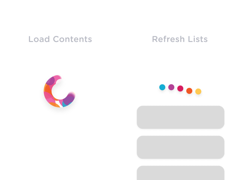
The animated feedback in these loading screens inform the user about the status of their activity during any pauses.
Match Between System and the Real World
The chocolate company Cacao 70 utilizes close-up shots of its products to make an immediate impression on the visitor.
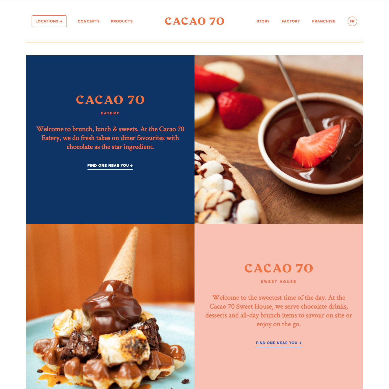
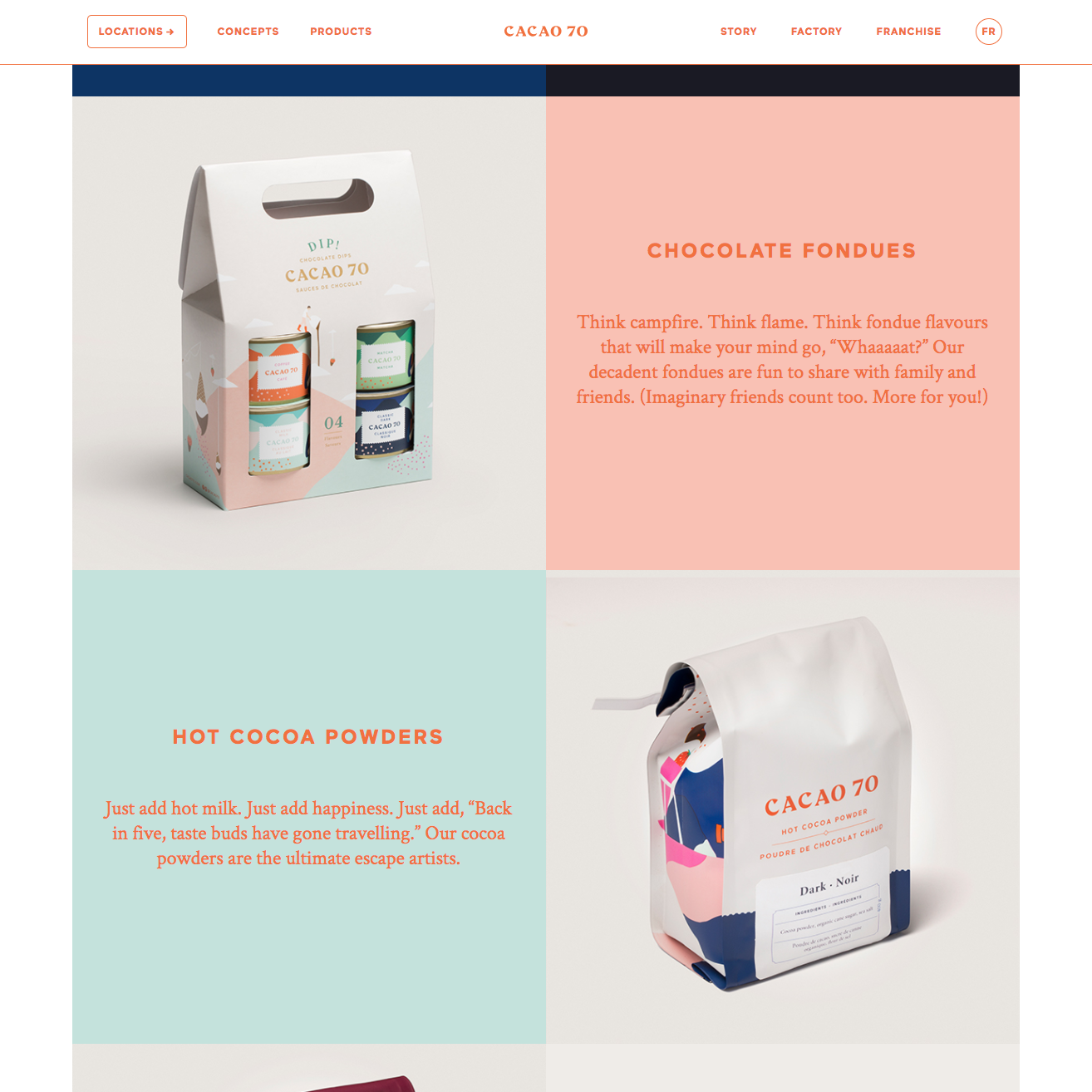
In addition, playful uses of color and approachable language make the online visit an immersive and delightful one, encouraging users to buy its products and visit its stores.
Error Prevention
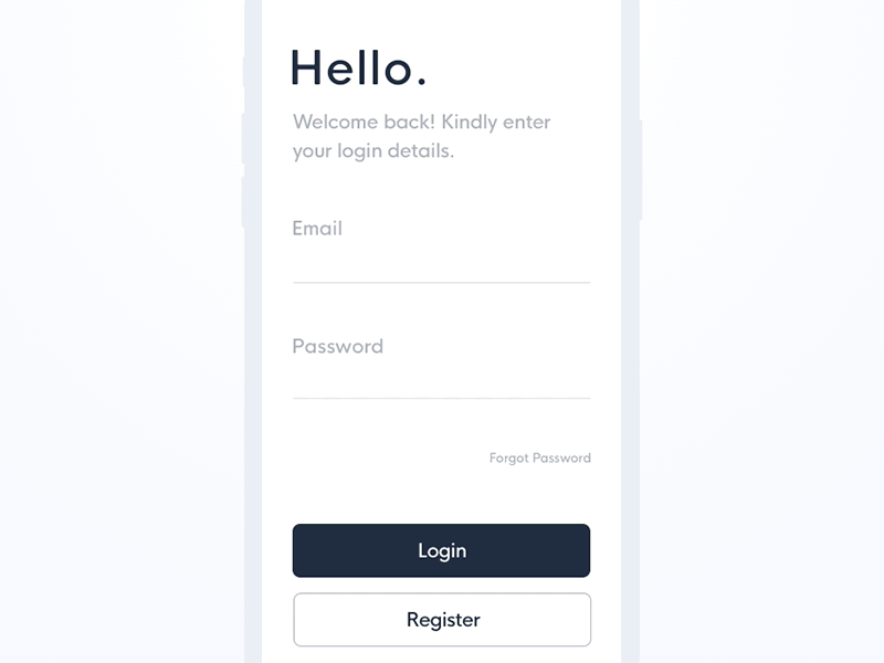
A form that has validation for each field can reduce user irritation and save time. Its immediate feedback prevents the user from filling out an entire form, only to have to go searching for any incorrectly typed information.
Aesthetic and Minimalist Design
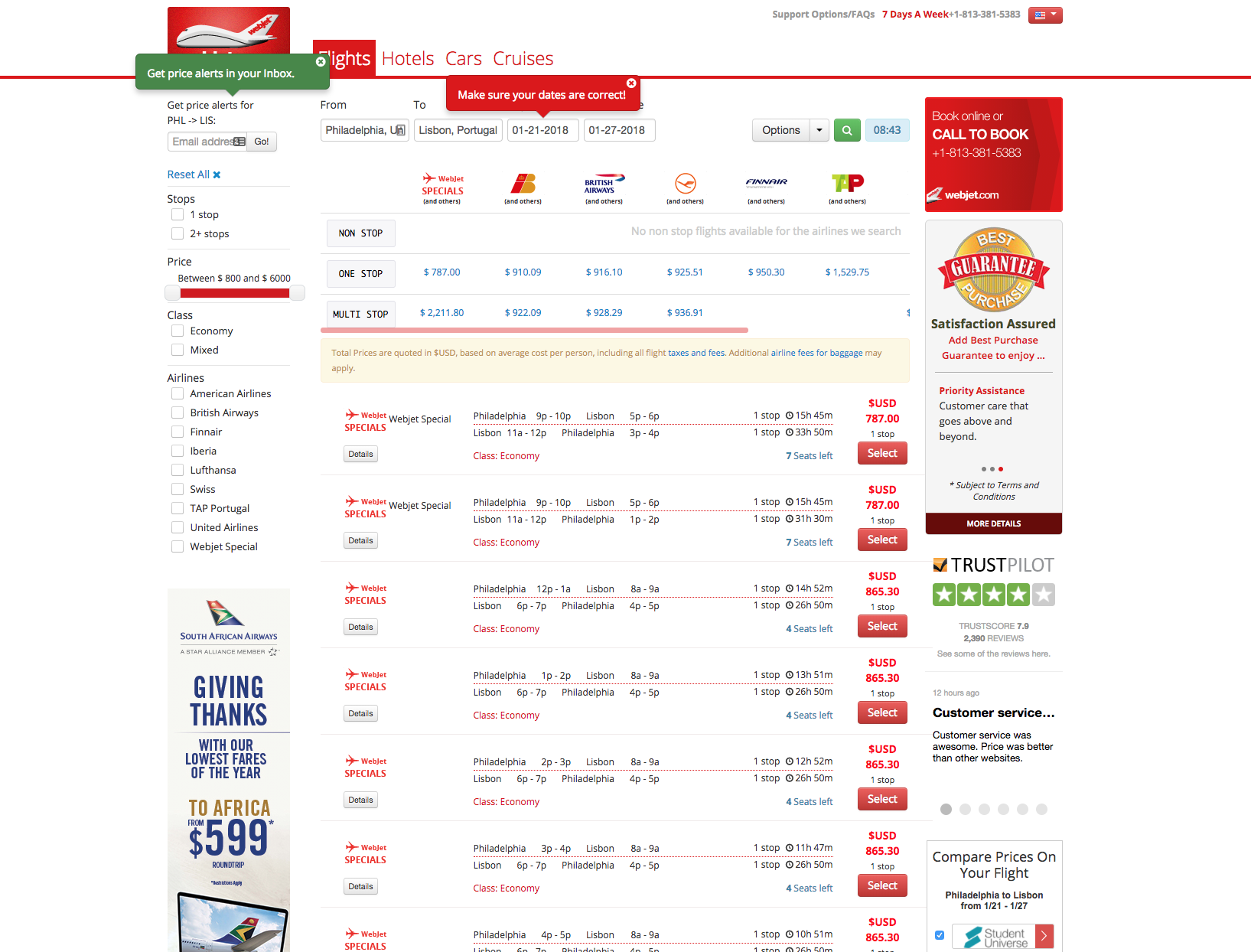
After running a search for a potential trip on WebJet.com, the window is crowded with results, ads, multiple calls to actions to receive price alerts and check my dates, and filters. It’s confusing to parse out the important details to compare the already information-heavy search results. A minimalist design would make it easier for users to quickly find the information they need.
Heuristic Evaluations Improve Usability
A heuristic evaluation helps locate usability issues within your product and may specify the usability principle in violation (ex: Inconsistencies between menus and buttons). Each finding is usually accompanied with a high-level recommendation on how to bring your product into compliance. Results may be clustered to discover any patterns across an interface, and to help stakeholders and product owners prioritize major, minor, and superficial changes.
A heuristic evaluation can be of great benefit to your digital prototype. It can provide immediate feedback to designers early in the process, integrate well into an iterative workflow, and offer solutions to identified issues. Expert evaluations also go hand in hand with other types of usability testing, as the results often reflect and build upon each other. If you want to know if your site’s core functionalities are user-friendly, a heuristic evaluation is a great place to start.
More reading:
Weinschenk & Barker Classification
Don Norman’s Principles of Design