There’s a running joke among designers. If you ask one for website best practices, the response is always, “It depends.” While there is no one-size-fits-all approach to your homepage, there are two universal objectives to strive for that put your users first.
Goal 1: Leave the user with the ability to sum up what your site is in a sentence or two
The two scroll movement rule
No matter how well known your site is, there’s always someone who’s unfamiliar with it. Your homepage is the biggest gateway of trust. If your users can’t figure out your site’s purpose, they won’t trust you, and they’ll most likely drop off. To keep new visitors on your site, the first few seconds of their journey need to be positive ones.
If your user moves their hand or finger to scroll twice and still doesn’t have a clue what the site is for, you have a low chance of converting them into a frequent user. While this is just a personal rule I follow, it sums up how soon a site should get its point across.
Not all summaries come in sentences
How often do you get to a website that has a big introductory statement as the first section? How many times do you actually read it?

...whoops?
There are many eye-leading tactics that make users read the grand opening statement, but a majority of users simply glimpse over it. But this doesn’t mean that the statement shouldn’t be there, or that it needs to be attention grabbing.
While our minds often force us away from reading anything on a website, plenty of users do take the first line of copy seriously on your site. Remember, there is never one type of user. Some users may rely on big headers while others skip over them. Without this opening statement, you could also lose every user with a screen reader immediately.
For the majority of users, though, the second section of your homepage adds in many of the missing pieces of the summary puzzle.
At Zivtech, we often work on websites that have many services or categories that sum up what the company does. A website we built last year for Clarifi is a great example of this. Clarifi helps their clients with financial wellness and focuses on a few core areas.
As the second section of the homepage, we presented the core focus areas in short action statements paired with visual aids of icon and color. When we conducted a user testing session, a couple users read the opening statement immediately, but many were drawn to these colorful boxes first.
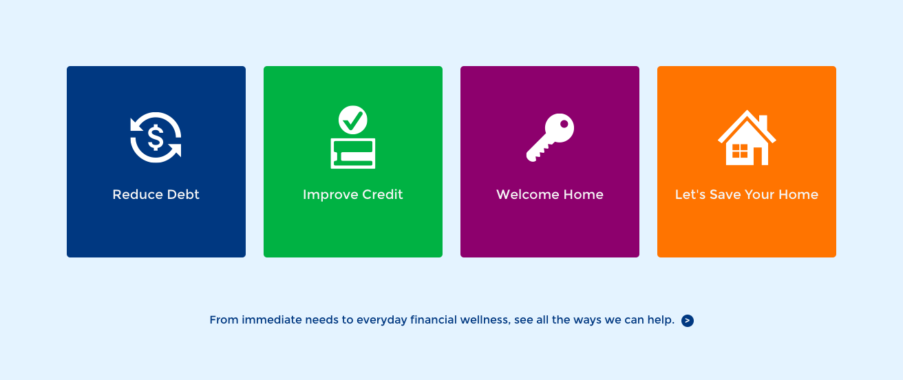
The statements were easier for most users to digest and identify with. They also resulted in a quick understanding of what Clarifi does and how the company could help.
Goal 2: Tell the user how your site can help them
You can’t help everyone, but you can prioritize and try to
When outlining objectives, we define all of our personas and use cases. We often come up with more than you can count on one hand. If your goal is to portray how you can help users, it can seem impossible to address every user’s needs on a homepage. Remember, quality over quantity also applies here with prioritization.
Let’s look at one step-by-step approach for prioritization:
- Look at your analytics to understand your users’ current behavior and content interests. This should be done alongside user interviews and testing about the current site.
- Cross-reference notes from speaking and observing users with the top pages in analytics. Look at the time spent on each page, too. See if your user feedback aligns with these analytics.
- Outline a hierarchy of topics to cover based on user feedback and analytics. Ask yourself these questions to help:
- Were there a few topics mentioned more often than the rest?
- Were the users that brought up those topics from the biggest user group?
- What was the main topic mentioned in the smaller user groups?
- What information did users need to be able to find the quickest?
- Is there information users come back for more frequently than others?
- Were there any topics that were mentioned by multiple types of users?
- Take the topic hierarchy from the previous step and have a second cross-referencing session. Put that list next to a list of new business goals (established in your project planning phase to prompt this redesign).
- When looking at user needs in addition to your business goals, outline the topics needed on your homepage. The order should be based on:
- The main topic(s) your biggest user group needs covered.
- Medium to large topics that the majority of your users want covered that aren’t specific to just one group.
- Topics users come back to the site most frequently for.
- Topics that have an urgency factor.
- Topics that most clearly convey the site’s message (without overpowering user needs first).
- Use the topic outline to influence your homepage layout, making sure topic is addressed from the top down.
- Scan your homepage layout from the perspective of each user group. Start with the biggest group and mark off any areas that may not make sense to them or help them. If you get to the smallest group and don’t have anything for them, see if there’s a place in the footer or within other content to address their needs.
Embrace small sacrifices
Sometimes adding more content to account for each small percentage of your visitors isn’t worth the effort or risks. Not only do we have budgets and have to prioritize, adding for smaller groups may take away from your biggest group’s ability to find information. Make your site’s purpose clear, and keep your focus on your biggest user groups to design the most effective homepage.